One of my follower reader – Mr. Praveen Sahu Uses a similar AFL for this relative strength…
It compares relative strength from the first bar on the screen and then does relative performance compared to first bar.
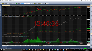
The center chart shows comparison of BankIndia with Nifty (orange and BankNifty green). Good part is that you can have multiple comparison symbols to do the comparison. While I dont like the fact that it does not have objectivity the way I like to see. When I work on a system, I always want system to tell me in simple graphical way (with clear entry exit rules if I want it to) Net net – I believe you may get benefited, hence mentioned here..
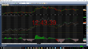
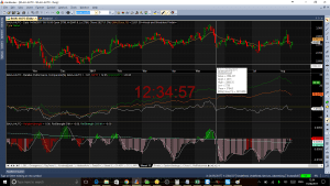
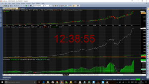
Few More examples –

To get the AFLs –
[activecampaign form=15]